Midjourney’s Evolution from V1 to V7
Midjourney didn’t just improve — it transformed. We tested each version side-by-side using identical prompts. V4 changed everything. V7 sealed the deal.
John Angelo Yap
Updated May 15, 2025
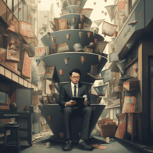
An old AI model vs. the newest, generated with Midjourney
Reading Time: 8 minutes
If you’ve ever played with AI image generators, you probably know Midjourney. And if you’ve been around since the early days, then yeah — you’ve seen things.
I’ve been using Midjourney since version one, and trust me, those early results were rough. Every prompt felt like rolling the dice: would I get a decent photo or a cursed gremlin with extra teeth and three shadows? You never knew.
But that’s what makes this journey so interesting. Watching an AI go from awkward, clunky experiments to full-blown, professional-grade imagery in just a few updates is wild. And now that V7 is out, I figured it was the perfect time to look back and ask: how far have we really come?
So I ran the same prompt through every version — from V1 to V7 — and the transformation speaks for itself. Let’s take a look.
Midjourney’s Improvement Told Through Images
Let me take you on a journey through the evolution of AI image generation. I've spent countless hours playing with Midjourney's models, from the early days of V1 to the latest V7 release, and the transformation is nothing short of mind-blowing. Using the exact same prompts across all versions, I'll show you just how far we've come.
Portrait (Human)
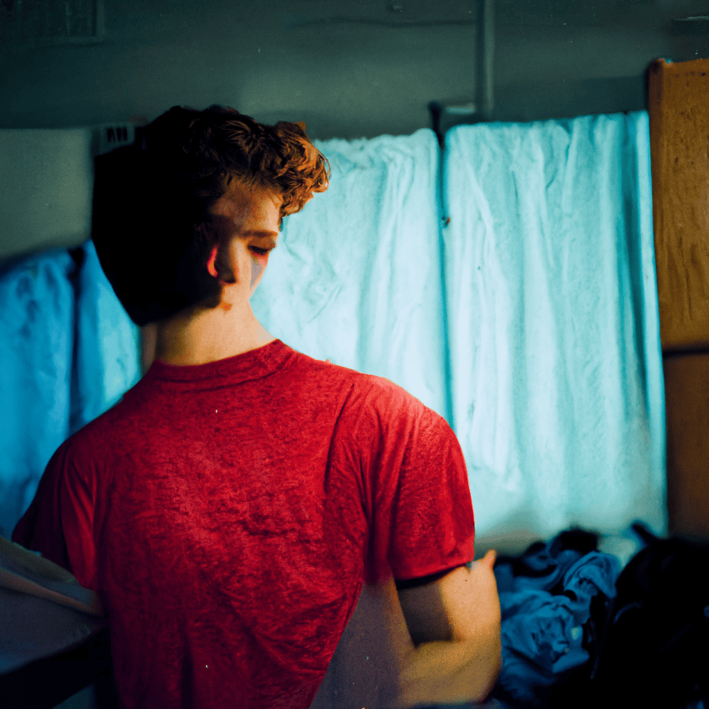
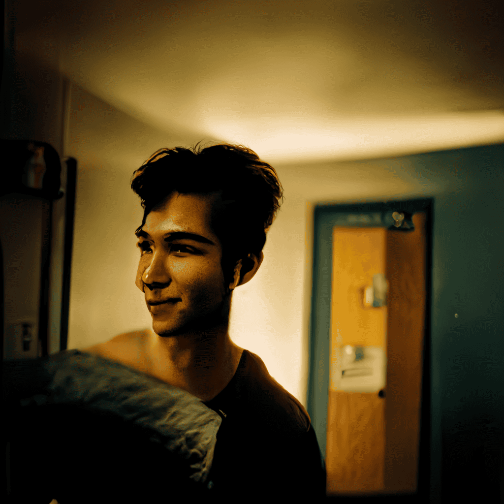
Prompt: a young man in a plain black top, indie, retro, medium format photography, warm light, dorm room aesthetics, candid
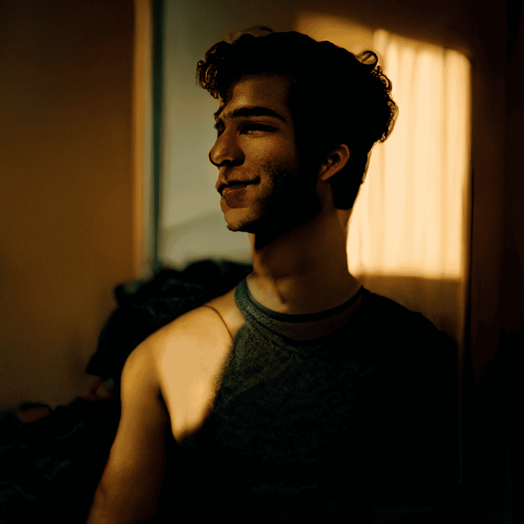
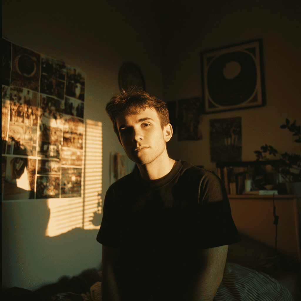
The early days of Midjourney were... rough, to put it kindly.
From V1 to V3, you could kinda tell it was attempting to generate a man, but the anatomy was all kinds of wrong. Heads were shaped like malformed potatoes, positioned at impossible angles, and the dorm background looked like an abstract painting rather than a living space. It was the uncanny valley, except the valley was more like a bottomless pit.
V4 marked the first major breakthrough, finally understanding the basic shape and form of a human being. The anatomical nightmares were gone, but something still felt off — that classic uncanny valley feeling that makes you uncomfortable without knowing exactly why.
By V5, the technical issues were largely resolved, but instead of a casual candid shot, we got something that looked like a professional photography session. V6 improved things further but still struggled with shadows and lighting.
Then came V7, and it's like someone actually snapped a photo with their smartphone. The casual posture, the natural lighting, the authentic dorm setting — it finally nailed what I was asking for all along.
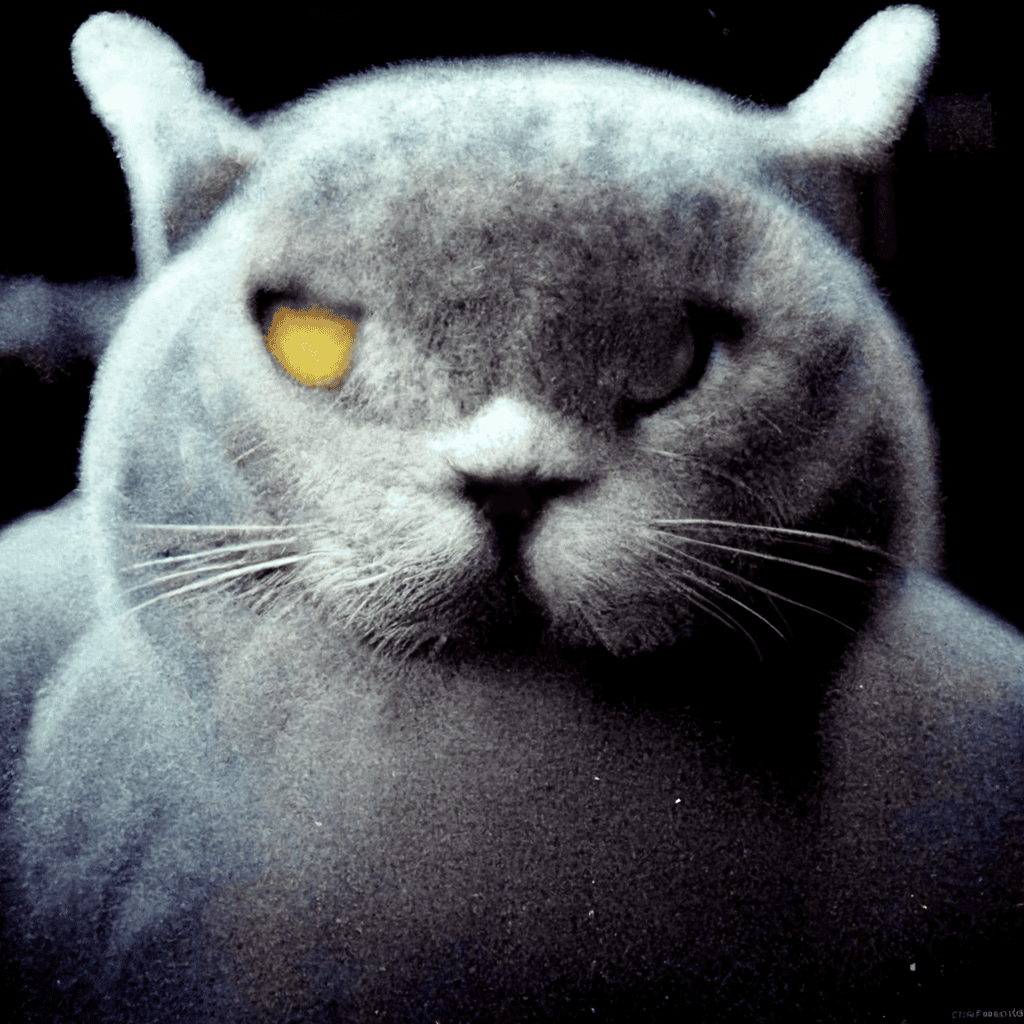
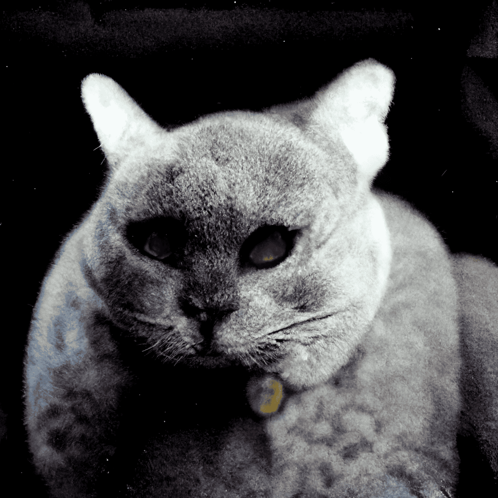
Portrait (Non-Human)
Prompt: grey british shorthair cat, medium shot, grainy disposable
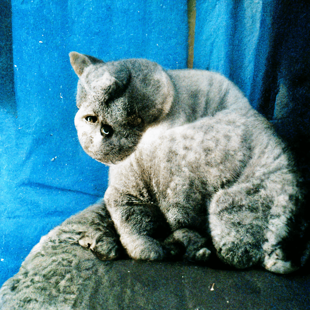
If you want to see nightmare fuel, just check out what V1 did with a simple cat prompt. The result looked like a tumor made of fur — something that would send children running and screaming.
V2 and V3 showed some improvement, but the eyes were still disturbingly wrong, and there wasn't much evolution between these two versions. Looking at these images, you'd think the AI had never actually seen a cat before.
By V4 and V5, things got substantially better. The cats actually looked like cats, but there was still that telltale AI giveaway — fur that blended together in an unnatural way, lacking the individual strands you'd see in a real photo.
V6 nailed it with a more realistic fur definition and texture that could pass as a real grainy disposable camera shot. Interestingly, in my opinion, V6 actually outperformed V7 for this one. The newest model's image had some strange lighting issues and even some tearing near the cat's ear.
Landscape
Prompt: the view from the peak of a mountain, sea of clouds, vast and mesmerizing landscape, Photography, captured with a Fujifilm GFX 100S medium format camera
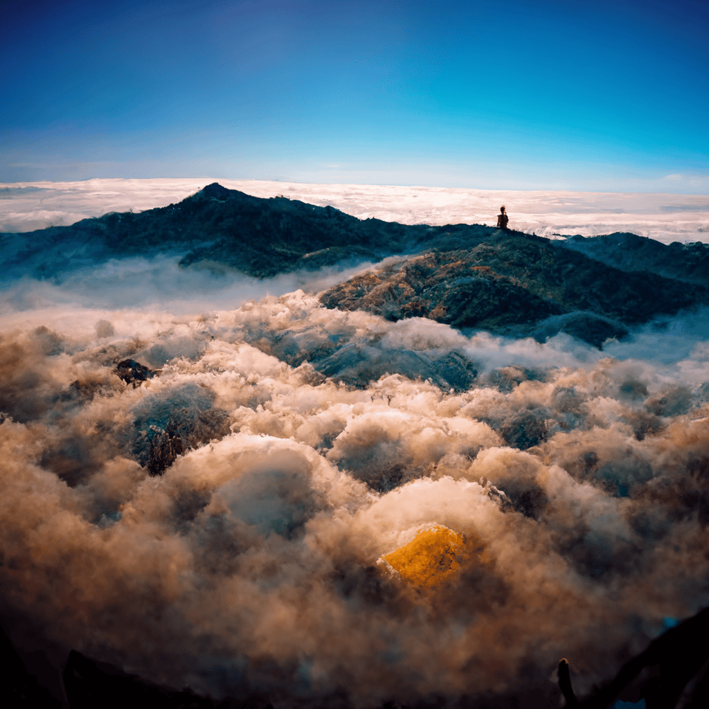
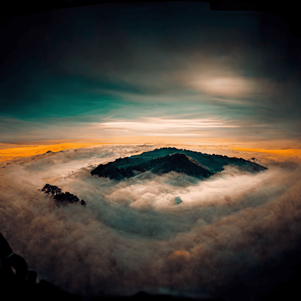
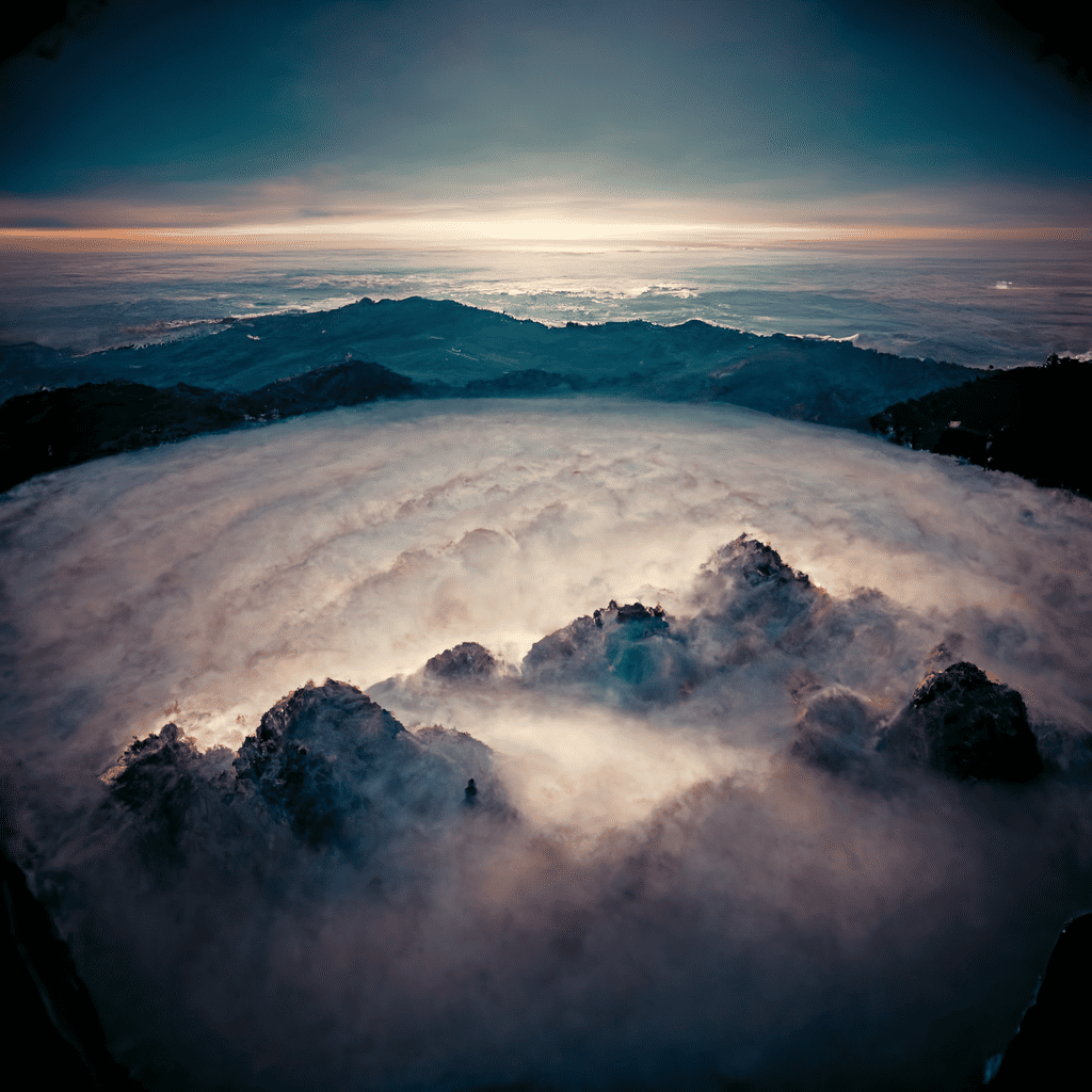
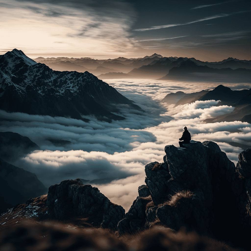
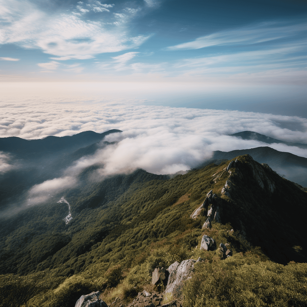
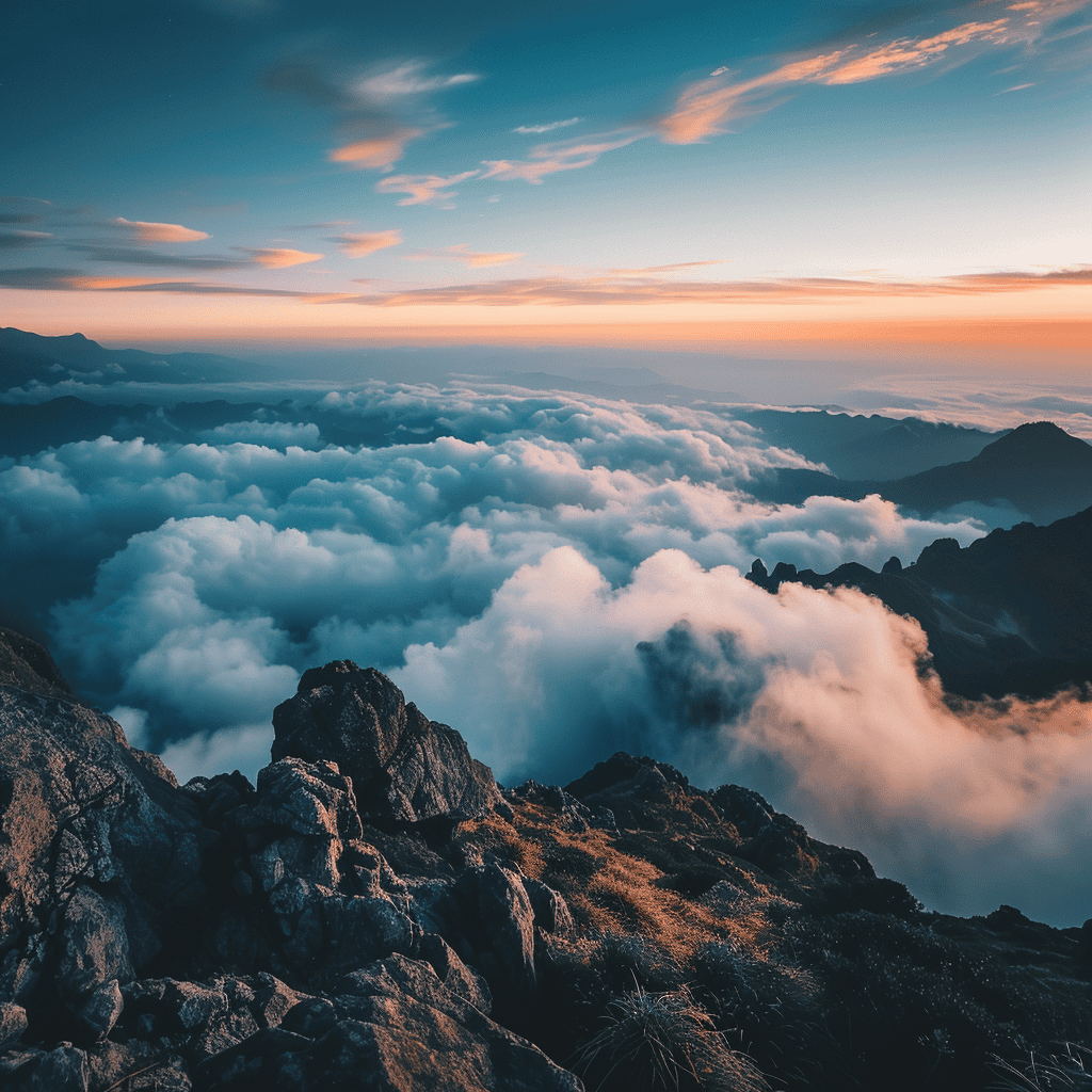
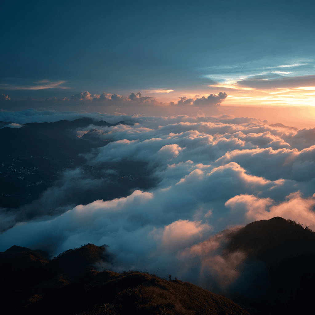
The early versions of Midjourney really struggled with landscapes. V1 through V3 seemed confused about the fundamental difference between mountains and clouds — they blended together in a disorienting mess. The perspective looked off, scale was all wrong, and the whole scene felt like a fever dream rather than a majestic mountain view.
V4 started to understand the assignment better but still had major issues with perspective and scaling. It also randomly inserted a person I never asked for in the prompt (a classic AI hallucination moment). By V5, these problems were largely fixed, with much better distinction between mountains and clouds, and a more natural sense of scale.
The jump to V6 and V7, though? The atmospheric lighting, the texture of the clouds, the dramatic mountain peaks — these newer versions created images that could easily pass for professional landscape photography. The difference between V6 and V7 here was minimal, suggesting that Midjourney might be approaching the ceiling for this particular type of imagery.
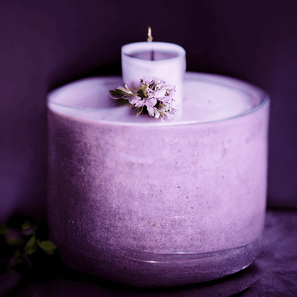
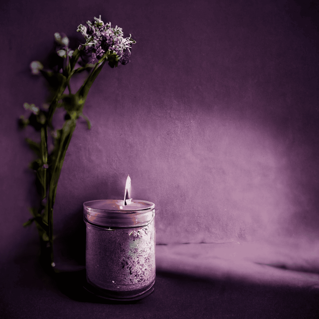
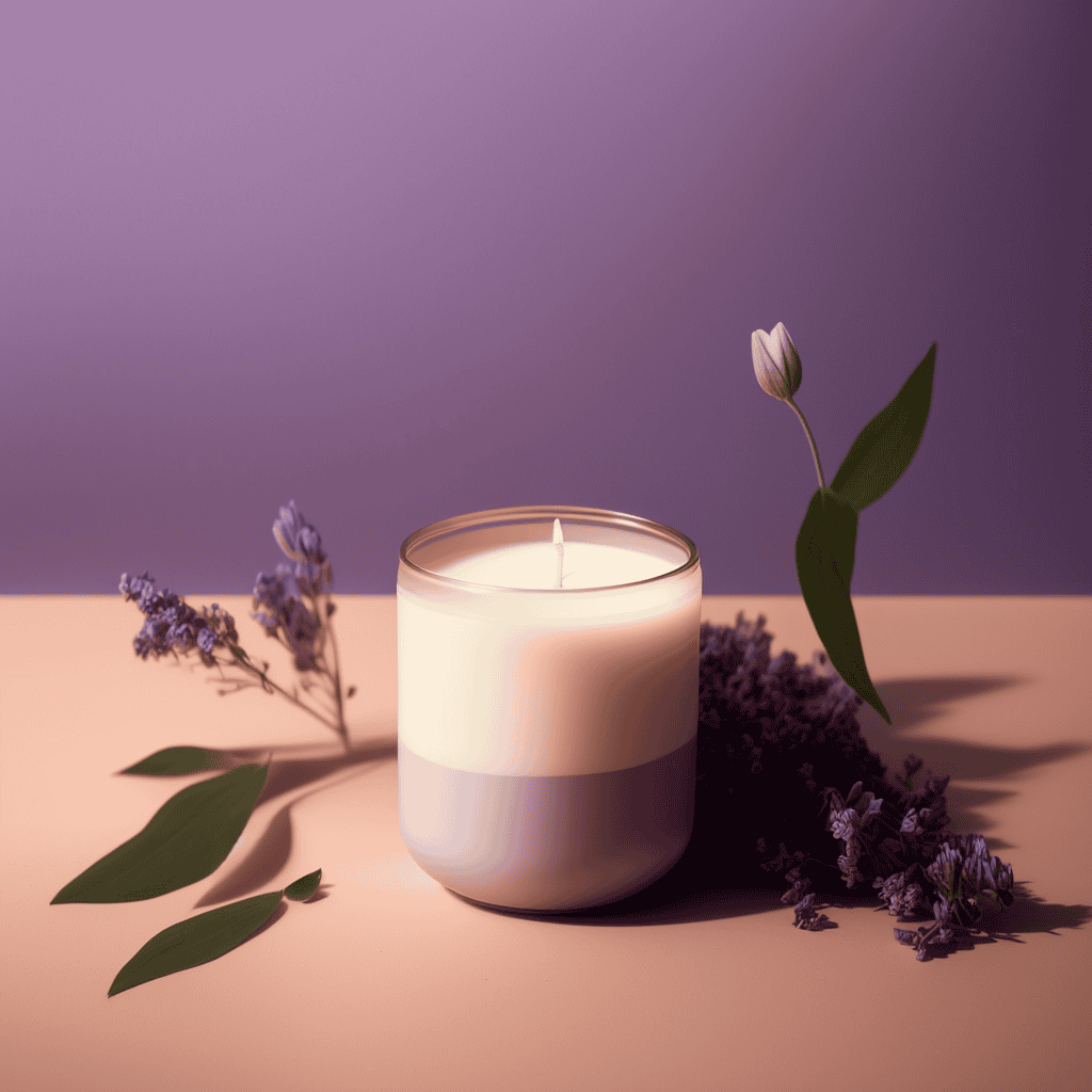
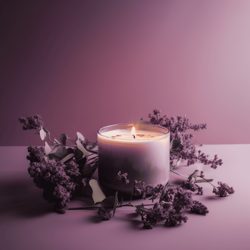
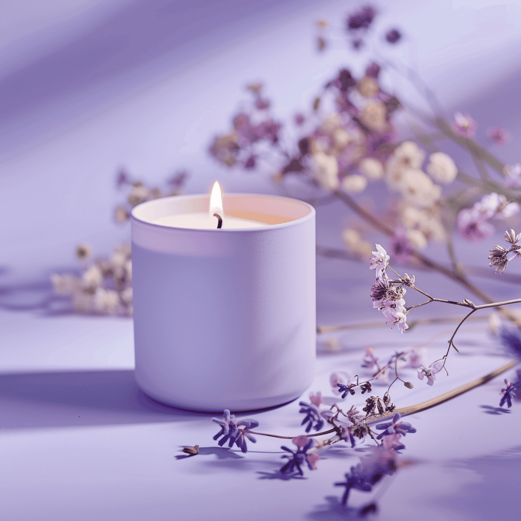
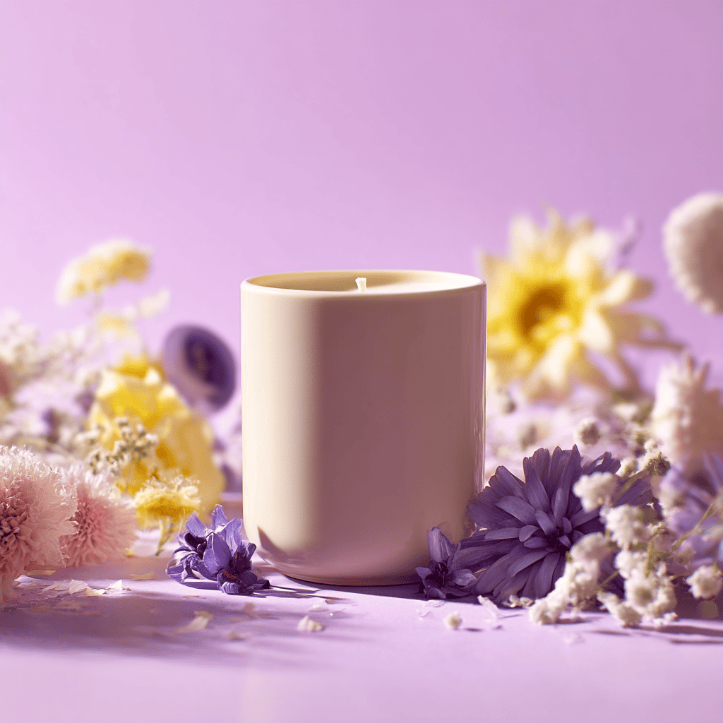
Product Photography
Prompt: commercial photography, a scented candle, on pastel purple background, with flowers, minimal, dreamy, soft lighting, center composition
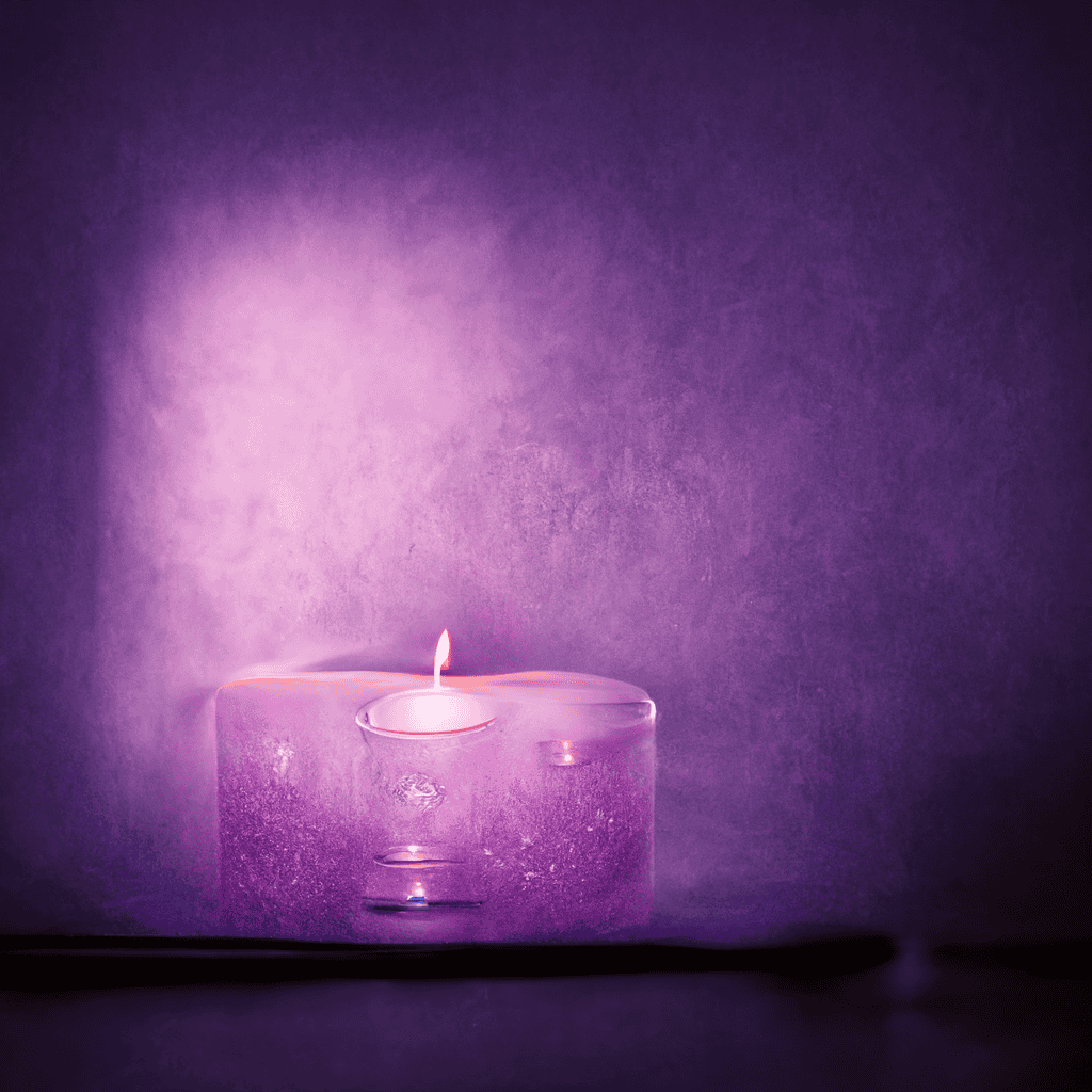
Early versions of Midjourney had no idea what a candle should look like. V1 and V2 produced strange, abstract interpretations that barely resembled anything cylindrical, let alone a functional candle.
V3 finally grasped the basic shape of a candle but still had that obvious "AI-generated" quality that plagued early text-to-image models — flat lighting, strange textures, and an overall lack of realism.
By V4, the model could produce a recognizable candle, but the result was painfully plain and lacked any understanding of how to render flowers or leaves realistically. V5 improved things but still didn't have that professional product photography feel with the dramatic lighting and contrast that makes a product pop off the page.
V6 and V7 completely transformed the game — they both produced images that could easily be mistaken for professional product photography, with perfectly centered candles, warm inviting lighting, and background flowers that complemented rather than distracted from the subject.
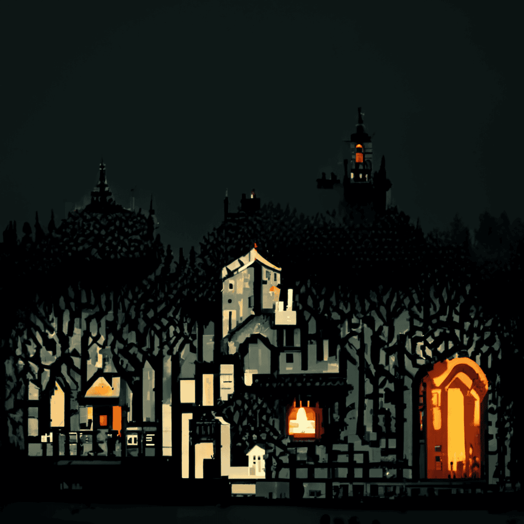
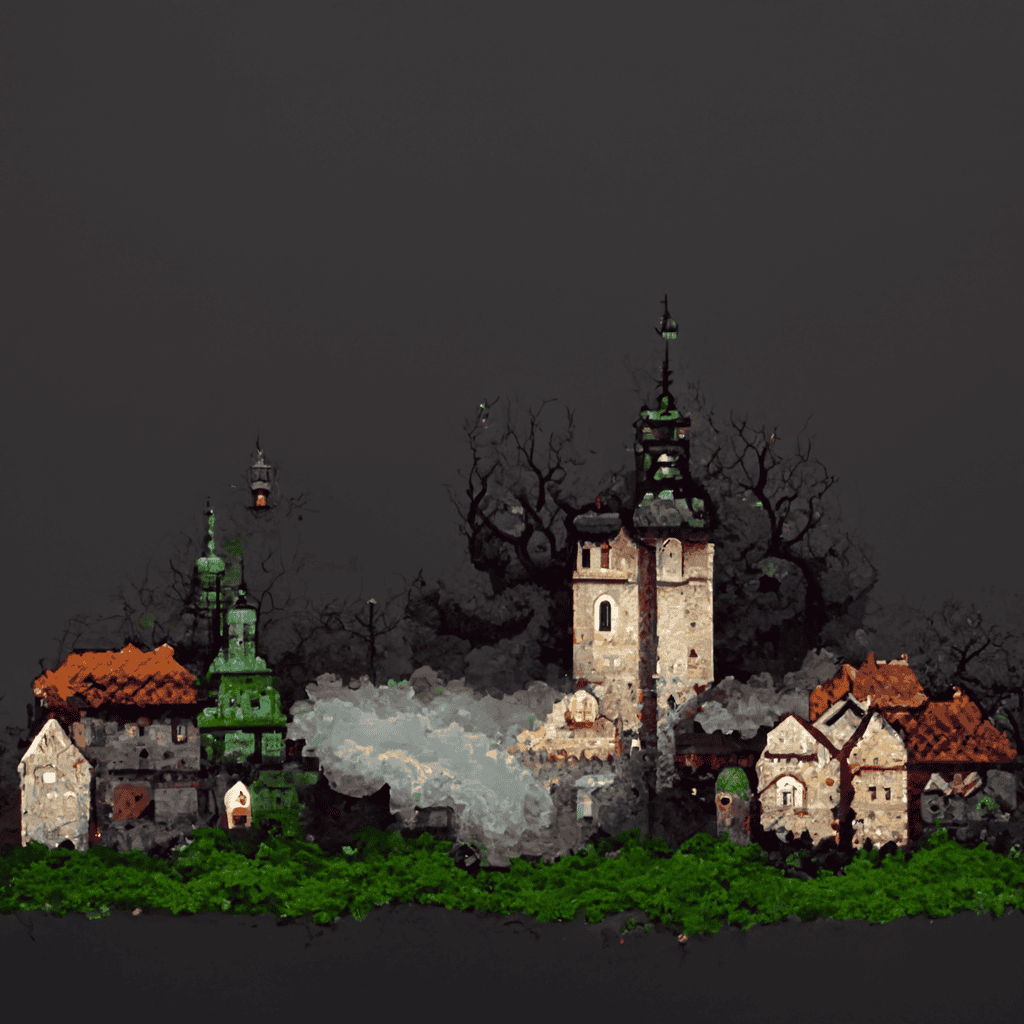
Pixel Art
Prompt: pixel art scene, a mythical medieval town with fog, dark fantasy, 8-bit game
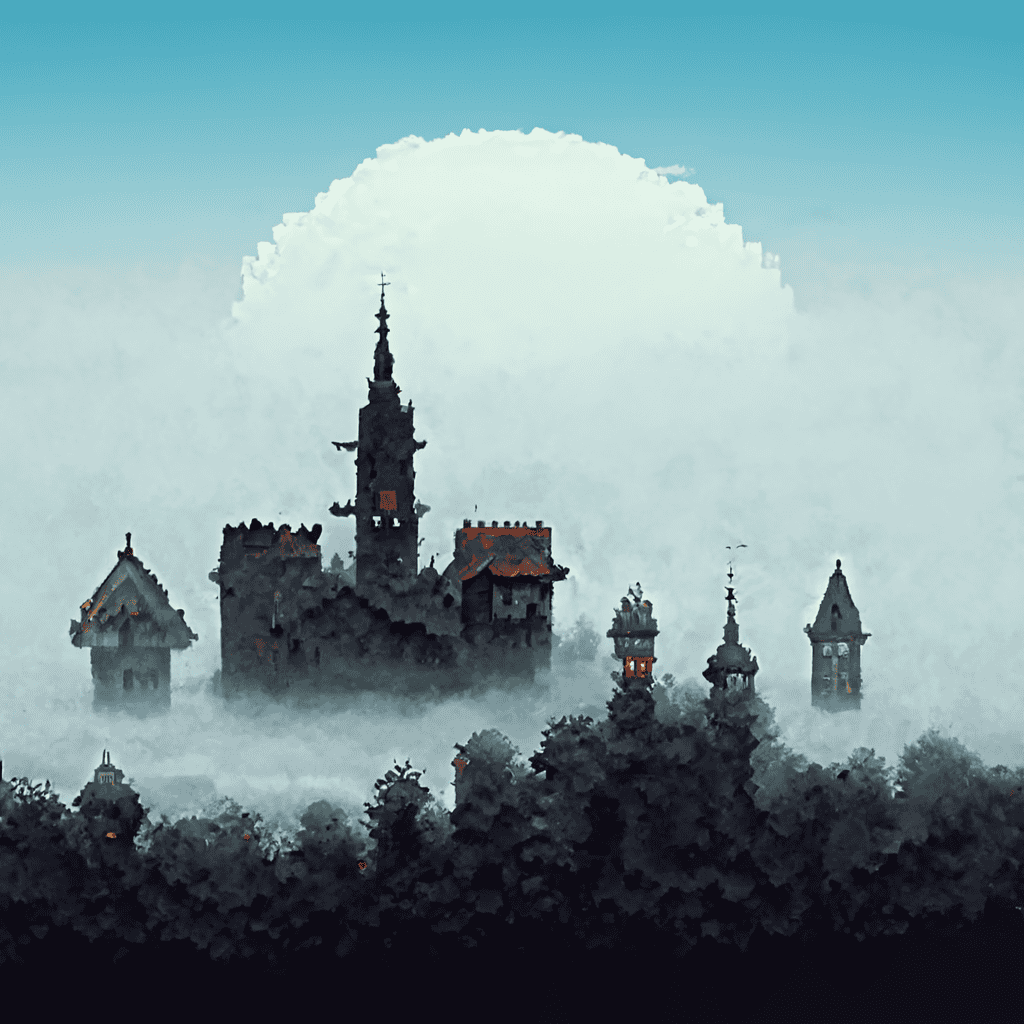
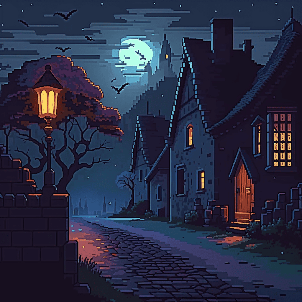
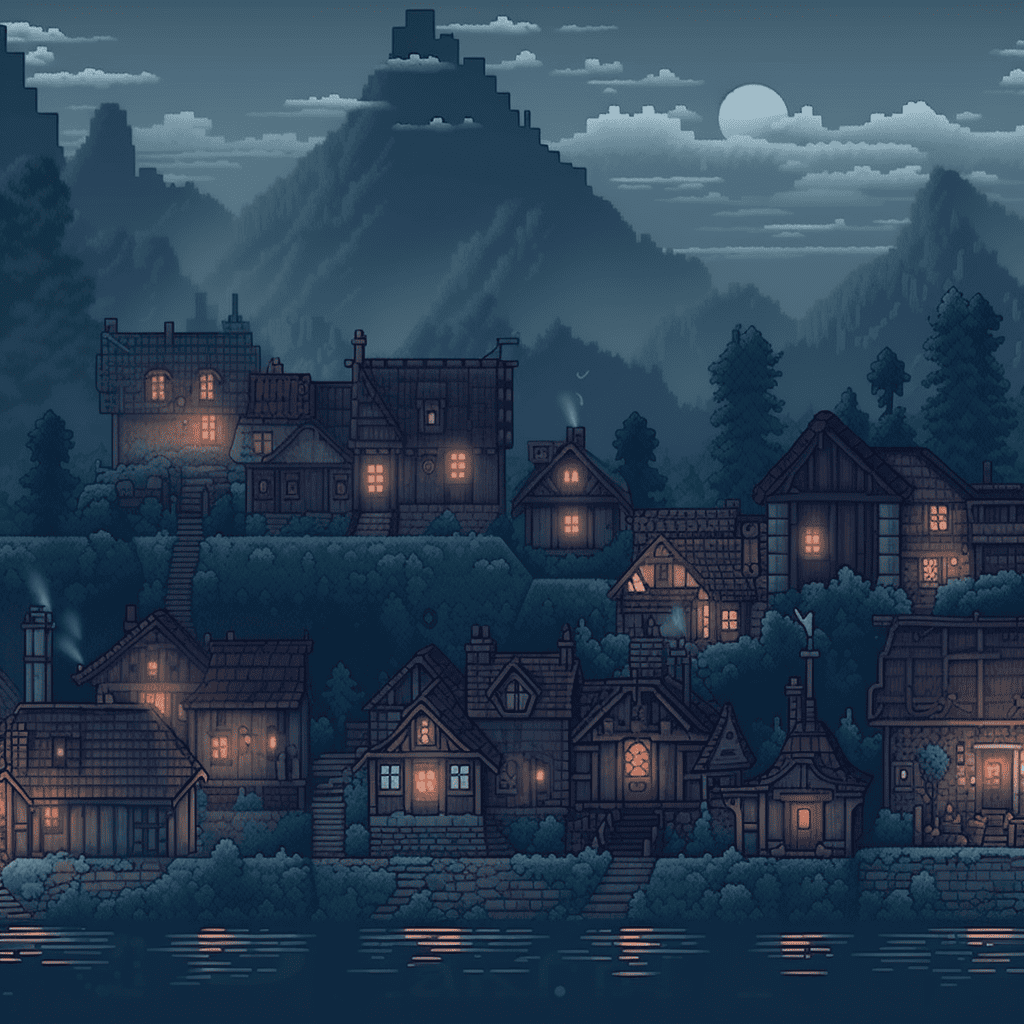
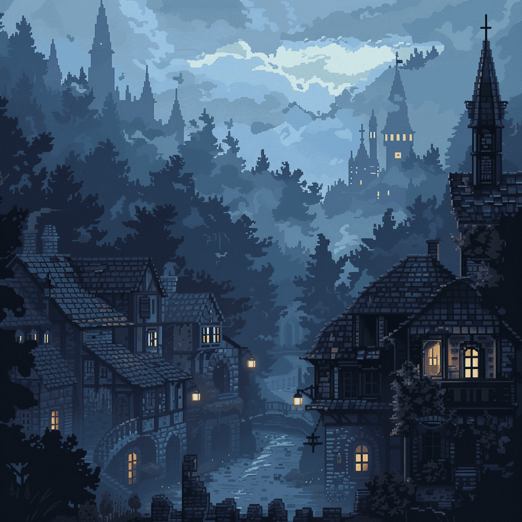
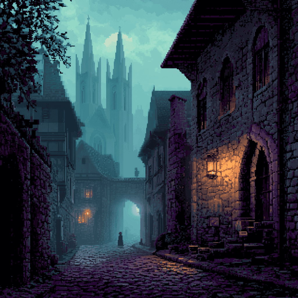
Pixel art continues to be a fascinating case study in Midjourney's evolution.
V1 through V3 were objectively terrible, but I was surprised that even at this early stage, the AI could recognize and generate the basic shapes of medieval towers — something it struggled with in other image categories. The results were crude and barely recognizable, but hey, the fundamental understanding was there.
Ironically, V4 might actually be the most successful version for true pixel art. It produced images with the authentic chunky pixels and limited color palette that define the genre.
As Midjourney advanced to V5, V6, and V7, the results became increasingly detailed and "HD" — which is actually counterintuitive to my prompt. The newer versions seem to simulate pixel art rather than create actual pixel art, adding smooth gradients and details that wouldn't be possible in the authentic medium.
Illustrations
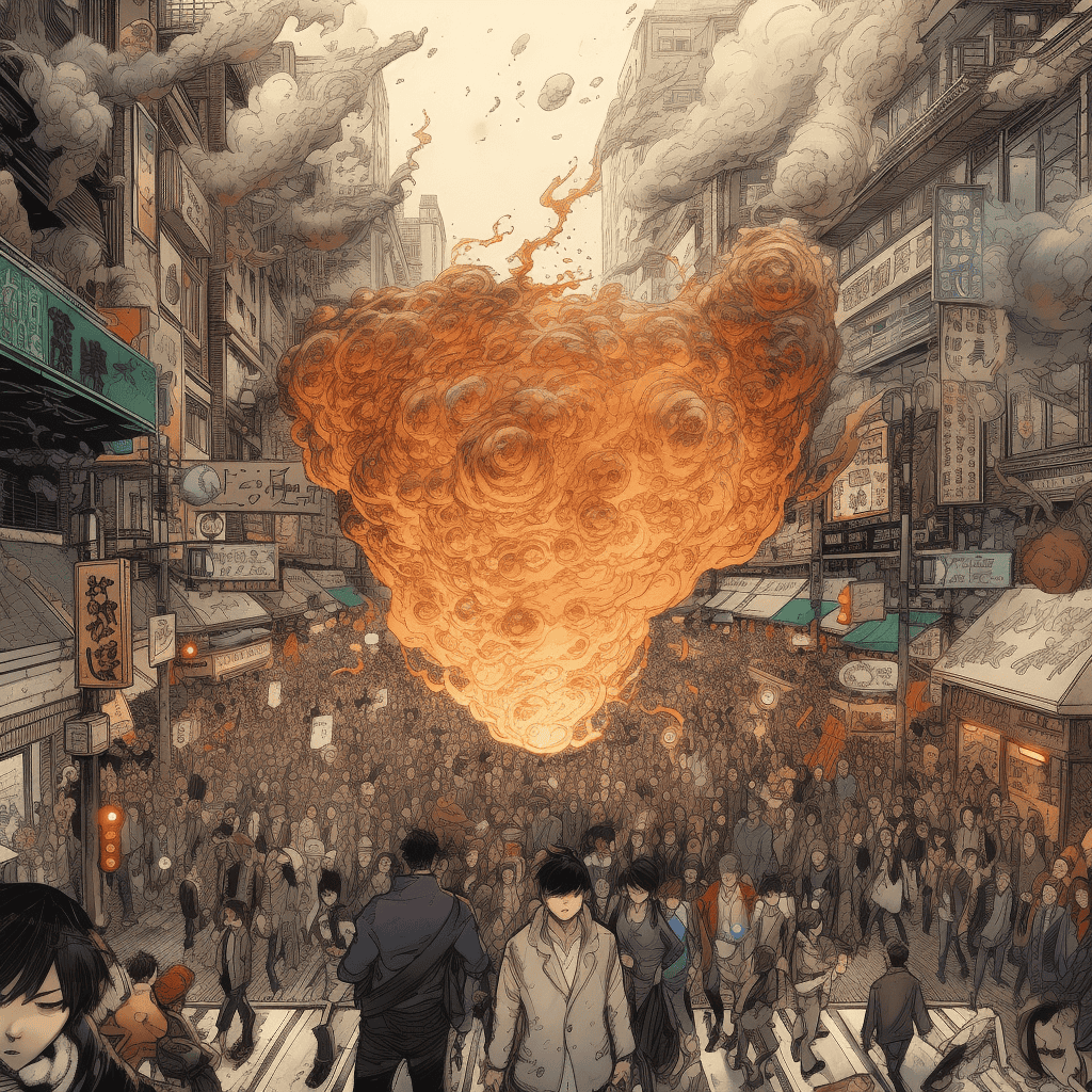
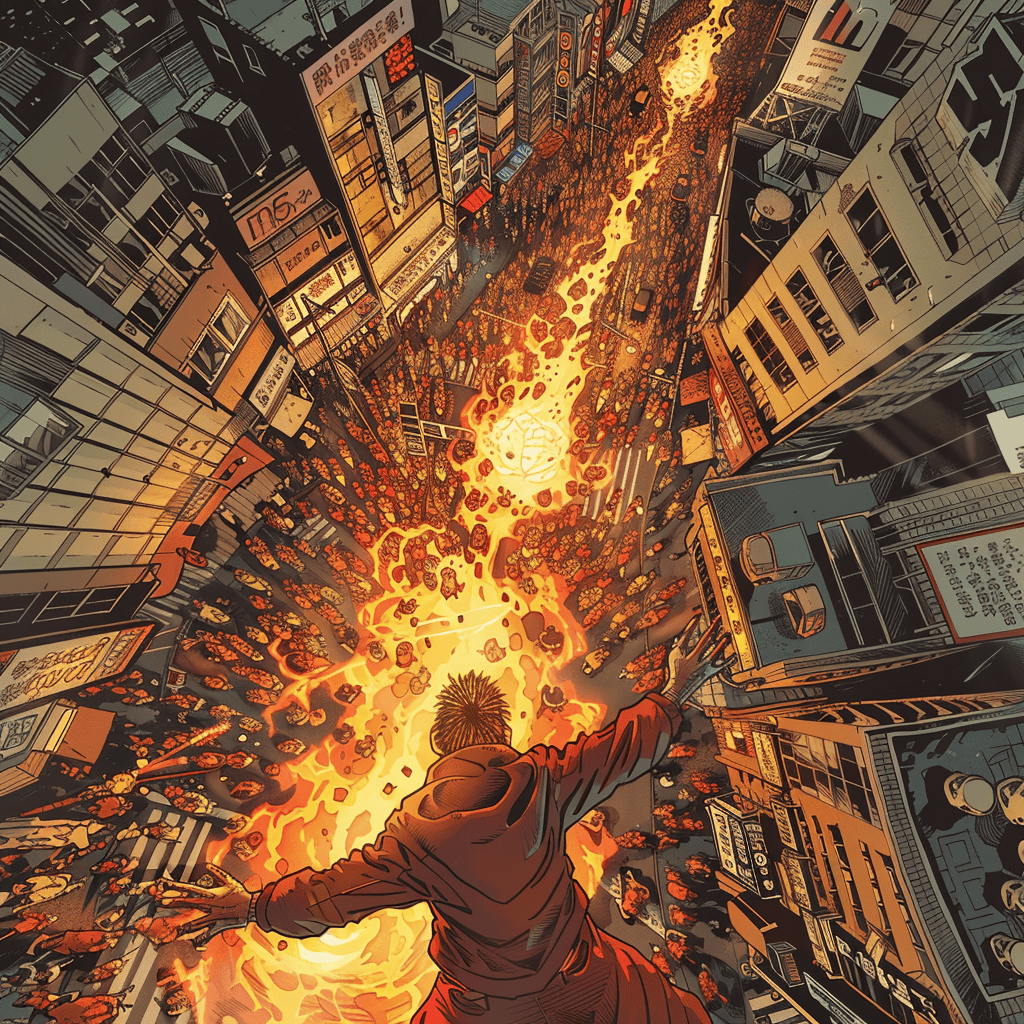
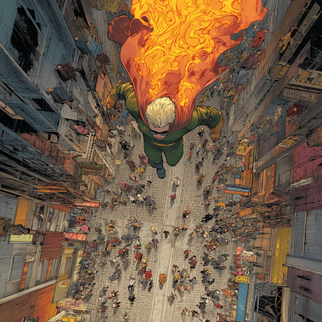
Prompt: a costumed supervillain with fire powers looking down a street full of people while flying, overhead perspective, graphic novel illustration style of katsuhiro otomo, comic book style, jim lee, brian michael bendis
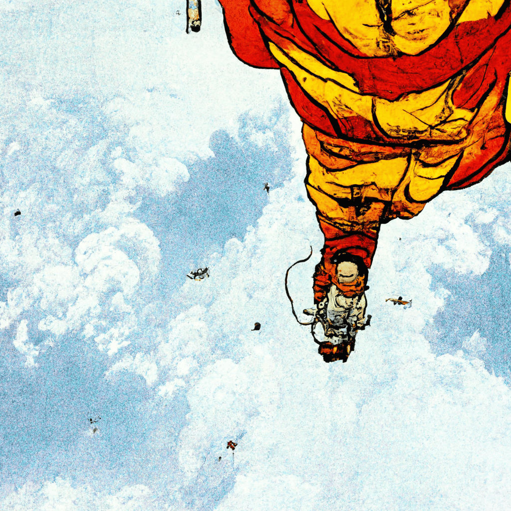
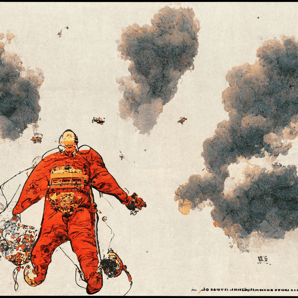
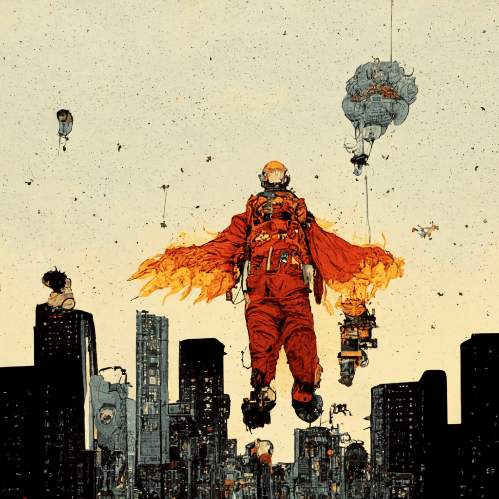
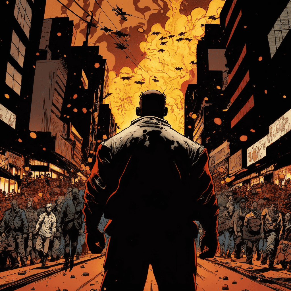
V1 through V3 understood maybe 10% of my prompt (the "supervillain" part) but ignored everything else. No background details, no proper perspective, and the subjects themselves looked like melted action figures rather than menacing antagonists.
V4 and V5 showed significant improvement but still missed critical elements that changed my prompt's intent entirely. V4 had the villain standing on the ground instead of flying, while V5 created a formless blob of fire above a crowd rather than a costumed character. The angles were wrong, the perspectives confused, and the comic book style inconsistent.
Then came V6 and V7, which nailed every single aspect of the prompt. The overhead angle, the detailed street full of people, the flying supervillain with fire powers, and the distinctive comic book art style — they were perfect. The images looked like they were torn straight from the pages of a professional comic book, with dynamic poses, dramatic lighting, and that perfect balance of realism and stylization that defines the medium.
Overall Thoughts?
After looking through all seven versions, one thing is clear: the biggest leap in Midjourney’s evolution happened between V3 and V4. That’s where it finally stopped being "just interesting tech" and started becoming an actual creative tool. Faces became human, objects looked like what they were supposed to, and prompts actually meant something.
The jump from V6 to V7, though? It’s not as dramatic, but it’s still incredibly impressive. V7 tightens everything. Lighting is more natural. Scenes feel more lived-in. It’s like they smoothed out the last few bumps that V6 couldn’t quite polish. So, no, V7 isn’t a revolution — but it is a refinement.
Where does it go from here? Who knows. But one thing’s for sure: V1 walked so V7 could run with two legs.
Want to Learn Even More?
If you enjoyed this article, subscribe to our free newsletter where we share tips & tricks on how to use tech & AI to grow and optimize your business, career, and life.