Responsive Design Tips (PX, %, EM, VH) in Breakdance Builder
Designing a responsive website isn't easy. It requires knowing about px, %, em, rem, vw, and vh. Luckily, Breakdance easily allows you to set these elements – but first you have to understand them.
Justin Gluska
Updated December 4, 2022

Reading Time: 6 minutes
When I first started developing websites around five years ago, I didn't know anything about using different size units for my CSS properties. I just used pixels... everywhere. It was a disaster. My sites looked great on my laptop, but as soon as someone viewed them on a device with different screen sizes, everything went downhill.
It was one of the first lessons I learned the hard way. I developed an entire website using only pixels, and when I went to test it out on my laptop, the website was so small that I couldn't even read the text.
Moral of the story? Responsive design is a thing for a reason.
There are a few different ways to make your CSS responsive, but one of the most common is using different size units for your properties. In this article, we're going to discuss when you should use each unit type so that you can create scalable, responsive websites.
What Are Pixels?
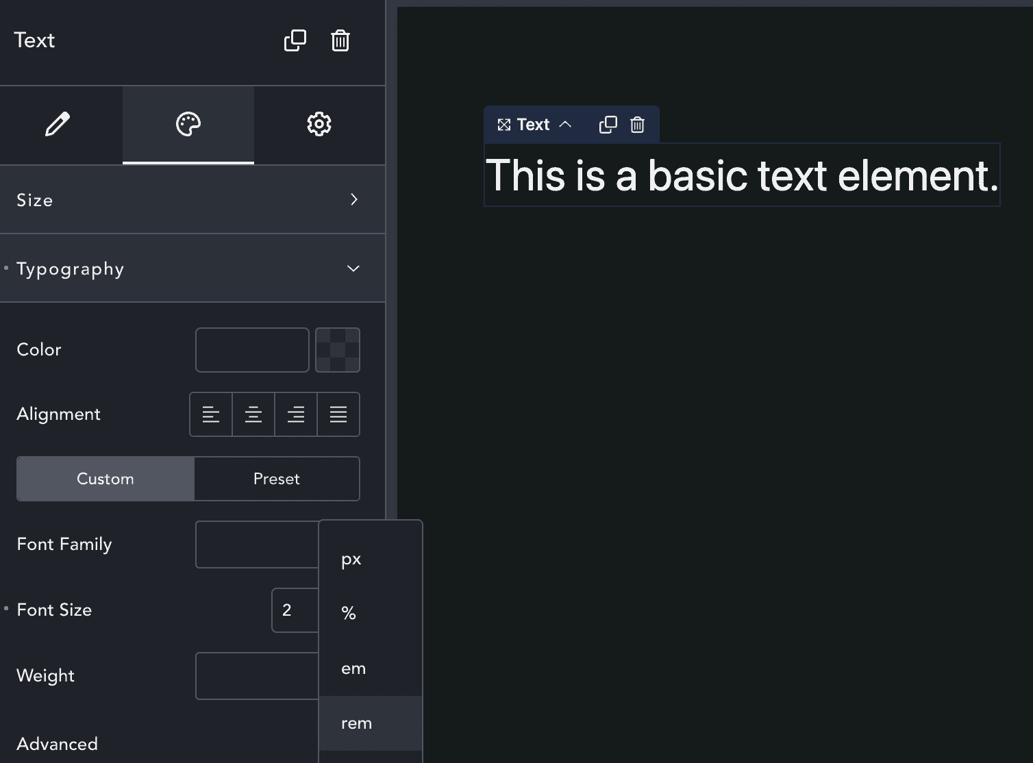
PX: Pixels are fixed-size units that are used in screen media (i.e. to be displayed on a computer screen, phone, or tablet). One pixel is equal to one dot on your screen.
Pixels are great for creating sharp images and can be useful when you want to control the exact size of an element. However, you should avoid using pixels for font sizes, as they can be difficult to read on different screen sizes.
What Are Percentages?
%: Percentages are relative units that are based on the size of the containing element. The percentage is calculated as a percentage of the containing element's width or height.
Percentages are great for creating responsive websites because they allow elements to resize based on the size of the screen. However, percentages can be a little tricky to understand. We recommend generally using them on elements that are contained within other elements, such as divs.
What's a Parent Element?
Before we get into Ems and Rems, we need to quickly discuss parent elements. A parent element is an HTML element that contains other HTML elements.
For example, in the code below, the div element is the parent element and the p element is the child element:
<div> <!-- div is the parent of p -->
  <p>This is a paragraph text (the child of div)</p>
</div>
The reason we're mentioning parent elements is because Ems and Rems are relative units that are based on the size of the parent element. We'll go over this soon.
What is EM?
EM: Ems are relative units that are based on the font size of the parent element. One em is equal to the font size of the parent element.
Ems are great for responsive design because they allow you to resize elements based on the font size of the parent element. This can be helpful if you want to ensure that text is always legible, no matter what screen size it's being viewed on.
If the font size of the parent element is 18px, then one em will be 18px. If you set an element's font size to 2em, then that element will have a font size of 36px. This will be responsive though, because if the font size of the parent element changes, then so will the child element's font size.
What is a REM?
REM: Rems are relative units that are based on the font size of the root element. The root element is the highest level element in the HTML document. The font size of the root element is usually set to 16px, but it can be changed using CSS.
Rem units are very similar to Em units, but they're based on the font size of the root element instead of the parent element. This can be helpful if you want to create responsive websites that use a different base font size.
For example, if the root element has a font size of 18px and you set an element's font size to 2rem, then that element will have a font size of 36px. However, if you change the font size of the root element to 20px, then the element's font size will automatically change to 40px.
What's the Difference Between Ems and Rems?
The main difference between Ems and Rems is that Ems are based on the font size of the parent element, while Rems are based on the font size of the root element.
Both Ems and Rems should most likely be your default choice when creating responsive websites. However, if you need to control the size of an element more precisely, then you may want to use fixed units like Pixels or Percentages.
In addition to font units, some units control the size of elements based on the screen size. These are called Viewport units and we'll focus on two different types: vw and vh.
What is VW?
VW: VW stands for Viewport Width. Viewport is the visible area of the screen. One vw unit is equal to 1% of the viewport width. So, if the viewport width is 100px, then one vw will be 1px.
VW units are great for responsive design because they allow you to resize elements based on the width of the screen.
For example, if you set an element's width to 50vw, then that element will be 50% of the viewport width. So, if the viewport width is 100px, then the element will be 50px wide.
What is VH?
VH: VH stands for Viewport Height. One vh unit is equal to 1% of the viewport height. So, if the viewport height is 100px, then one vh will be 1px.
This works the same way as VW does, but it's based on the height of the screen instead of the width.
For example, if you set an element's height to 50vh, then that element will be 50% of the viewport height. So, if the viewport height is 100px, then the element will be 50px tall. If you're trying to make a hero element on your webpage, set the minimum height of the section to a vh of 100, and it will fill the entire screen, no matter what the height of the device is.
Using Responsive Design Breakdance Video Tutorial
Conclusion
Breakdance is a very powerful tool for creating responsive WordPress websites, but it's critical that you understand how to use all of the different size units to become a responsive web designer. In this article, we've covered the most common units: pixels, ems, rems, vw, and vh.
Remember, each unit has its own strengths and weaknesses. For example, pixels are great for precise control but they don't scale well on smaller screens. Ems and rems are great for responsive design because they scale relative to other elements, but they can be difficult to control precisely.
As a general rule, you should use ems or rems for most of your sizing needs and reserve pixels and percentages for specific cases where you need more control. With a little practice, you'll be a pro in no time! Have any questions about integrating any of these with Breakdance? Leave a comment below!
Want to Learn Even More?
If you enjoyed this article, subscribe to our free newsletter where we share tips & tricks on how to use tech & AI to grow and optimize your business, career, and life.