How to Make a Sliding Popout Menu in Breakdance Builder
Responsive menu popouts can really give your site a professional feel. Adding one in Breakdance only takes a few minutes.
Justin Gluska
Updated October 24, 2022
Reading Time: 1 minute
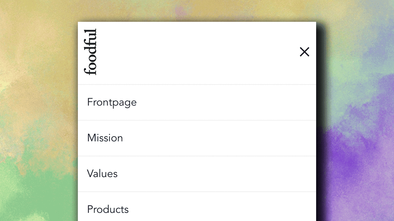
In this video, we'll go over creating a responsive popup menu that launches from a menu button in your site’s header. Sometimes you want to add a vertical sliding menu as opposed to the default top horizontal menu that is generally used on both websites. The menu bar we'll be creating today works on all device sizes and includes smooth transitions.
You’ll learn how to create a menu popup that:
- Is engaging, functional, and animated
- Is responsive on mobile and tablets
To do this, we'll be adding a popup element, aligning it to the left, setting the width to 480px, setting the height to 100%, and then adding text links and a brand logo inside the element. We'll also add an entry fade & exit fade animation. Here's how:
Want to Learn Even More?
If you enjoyed this article, subscribe to our free newsletter where we share tips & tricks on how to use tech & AI to grow and optimize your business, career, and life.