Midjourney V7 vs. V6.1: How Much of An Improvement is V7?
New model, same prompts. Midjourney V7 enters the ring with bold promises — but how does it really compare to V6.1? Here's a no-fluff breakdown.
John Angelo Yap
Updated April 20, 2025
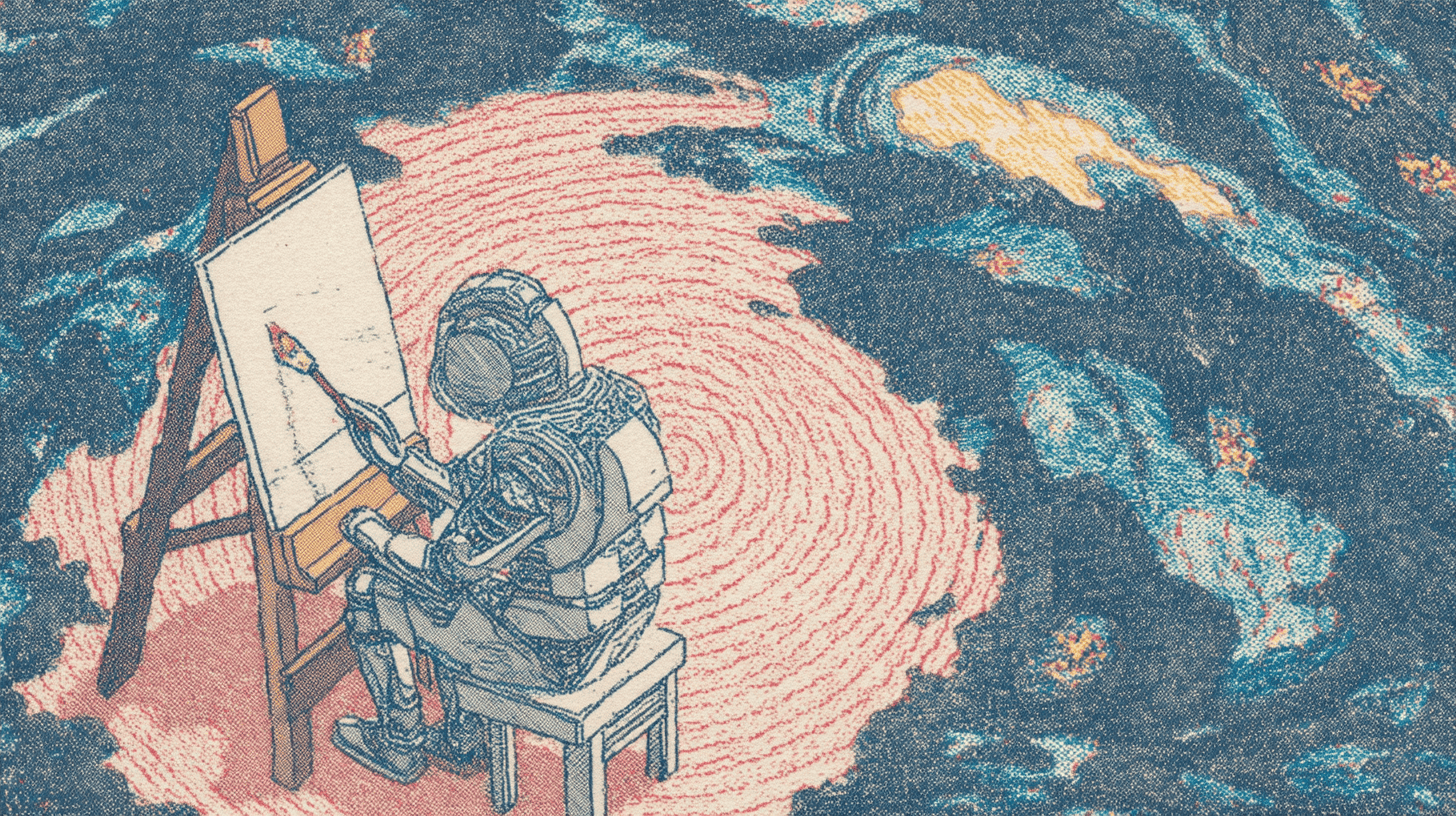
The robot painter, generated by Midjourney V7
Reading Time: 8 minutes
Midjourney just dropped V7, and the buzz around it is loud. Faster rendering, better prompt understanding, fewer weird hands — the usual promises, but turned up to eleven. If you’ve been using V6.1, you might be wondering: is this actually a leap forward, or just another iteration wrapped in marketing sparkle?
According to Midjourney, V7 isn’t just an update — it’s a rework of how the model interprets prompts, textures, and even your personal aesthetic preferences. Sounds great on paper. But let’s face it, we’ve heard similar things before.
So I decided to put it to the test. Same prompts, side-by-side comparisons, across different categories like portraits, landscapes, product shots, and more.
Here’s what I found when I let V7 go head-to-head with its predecessor.
What is Midjourney?
Midjourney is an AI image generation platform that transforms text prompts into stunning visual art. Unlike basic image generators, it specializes in creating artistic, imaginative visuals with remarkable attention to detail and aesthetic quality. Simply describe what you want, and Midjourney creates it into reality within seconds.
With over 15 million users generating more than a billion images, it’s safe to say that Midjourney has changed how we approach AI art. If you want to see how it evolved up to V6, this article should cover everything.
What’s New With Midjourney?
According to Midjourney, V7 isn't just another update — it's a complete transformation that elevates AI image generation to extraordinary new heights. Here’s an overview of their promises with this model:
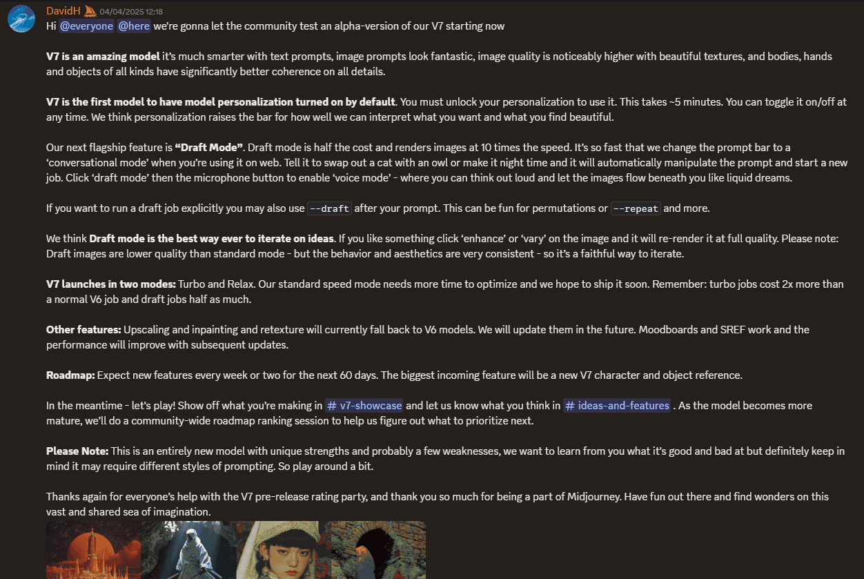
V7 should be able to show improved understanding of text prompts and create images with stunning coherence across details. If we’re taking everything they’re saying at face value, bodies and hands (that long-time AI art challenge) should now appear naturally proportioned, textures should look realistic, and objects should show logical relationships within scenes.
Lots of “shoulds,” I know.
V7 also introduces "Draft Mode" — a feature that generates images at 10x the speed at half the cost. The new voice mode lets you verbalize concepts while watching images materialize beneath your words like "liquid dreams." When you create something promising, simply hit "enhance" or "vary" to render it in full quality.
It also makes turns on personalization by default. With just a 5-minute setup process, Midjourney begins learning your aesthetic preferences, interpreting your prompts through the lens of what you find beautiful. This personalization can be toggled on or off anytime, giving you ultimate control over your creative process.
So, does it deliver?
Midjourney V7 vs. V6.1: Same Prompts Compared
Portrait
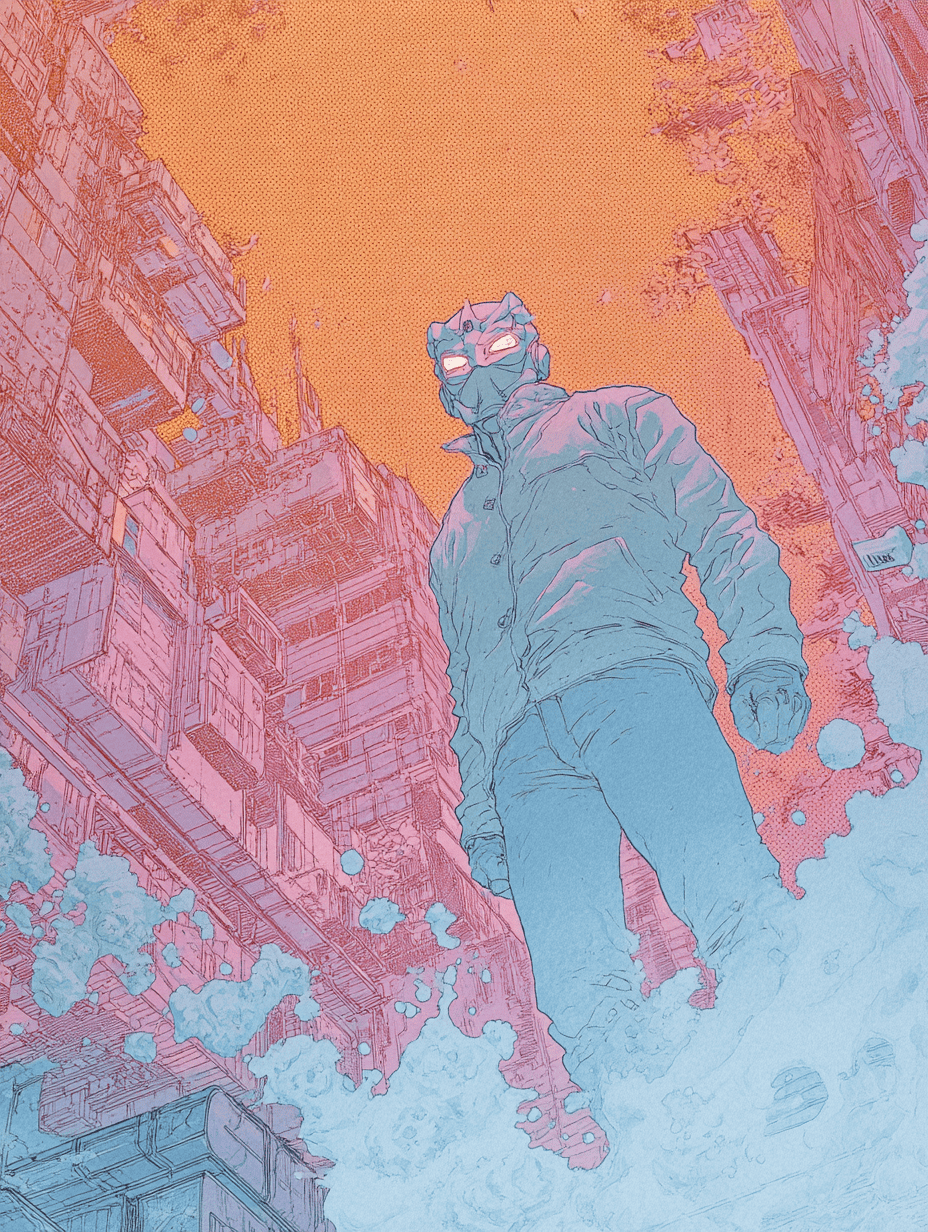
Prompt: a woman running a marathon, realistic, cinematic, photo, action shot
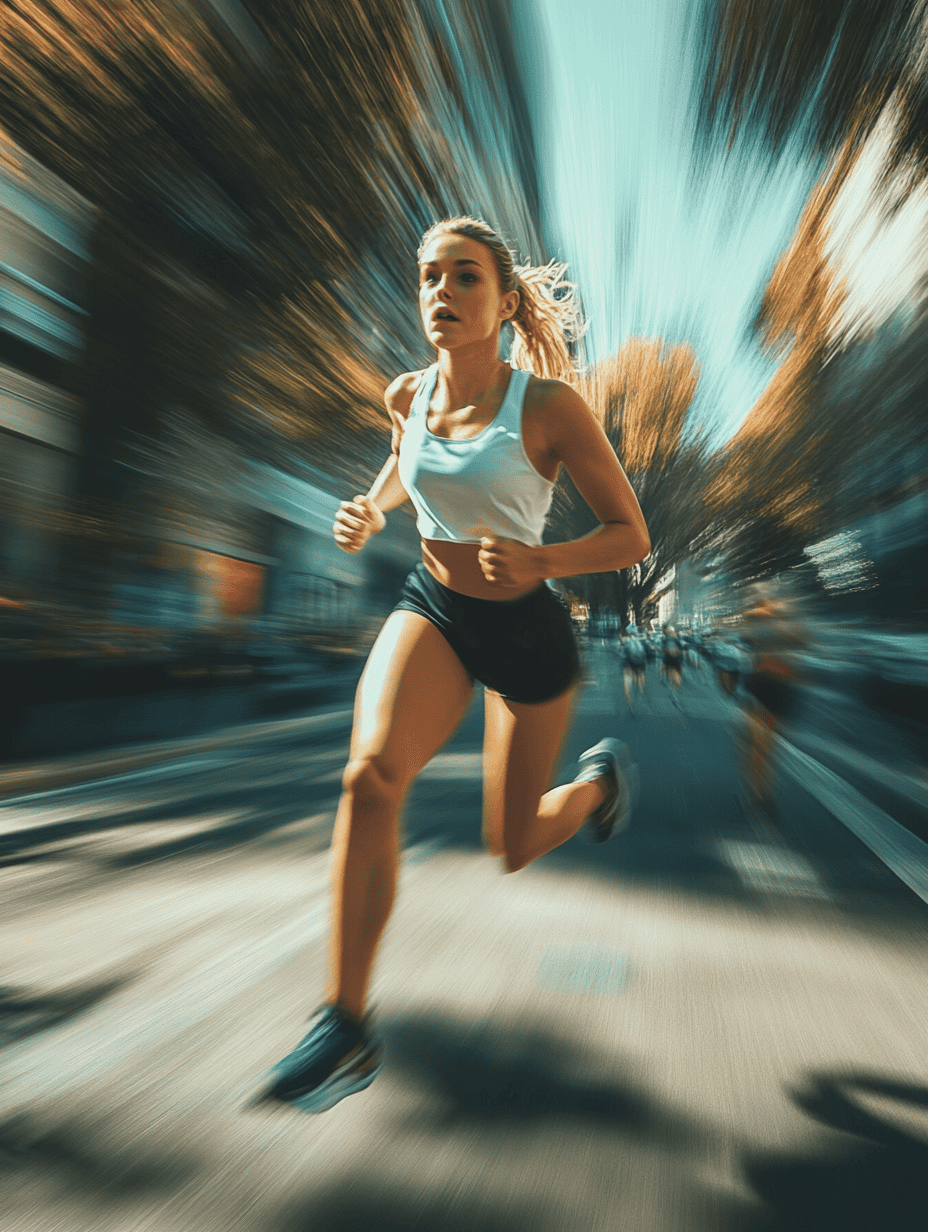
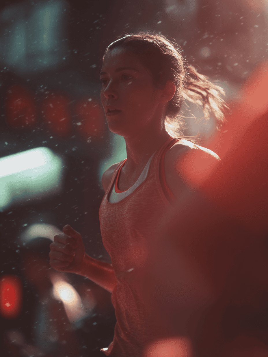
The difference is night and day here. The V6.1 image screams "I'm AI-generated" from a mile away. It's got that exaggerated motion blur that V6.1 sometimes slaps on anything labeled as "action." You know the look — that almost cartoonish attempt at dynamism that never quite lands right.
The V7 version, though? The realism is cranked up to eleven — slightly gritty, with the kind of imperfections you'd expect from an actual sports photographer catching someone mid-run.
Landscape
Prompt: 1993 Polaroid, professional landscape photography, a beautiful beach at sunset from a high vantage point
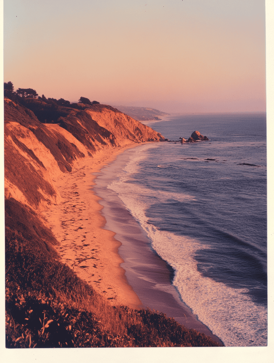
The beach Polaroid comparison isn't quite as dramatic, but it reveals something important about V7's evolution. Both models delivered solid, realistic images with that classic Polaroid vibe.
The V6.1 version was already impressive, capturing most elements convincingly — except those waves. If you've spent any time at actual beaches, you'd immediately notice how artificial the water movement looks.
V7's improvement here is subtle but meaningful. The wave patterns and water textures look significantly more natural, with the kind of random chaos that real ocean waves have. It's not a jaw-dropping upgrade, but it shows that Midjourney's developers have been fine-tuning their understanding of natural elements.
Everything else — the sand texture, lighting, and that distinctive Polaroid color profile — remains equally strong in both versions.
Film Stills
Prompt: film still, 90s movie directed by david lynch, golden hour, a sinister woman in a white dress is seen from afar as a man walks into a forest, horror
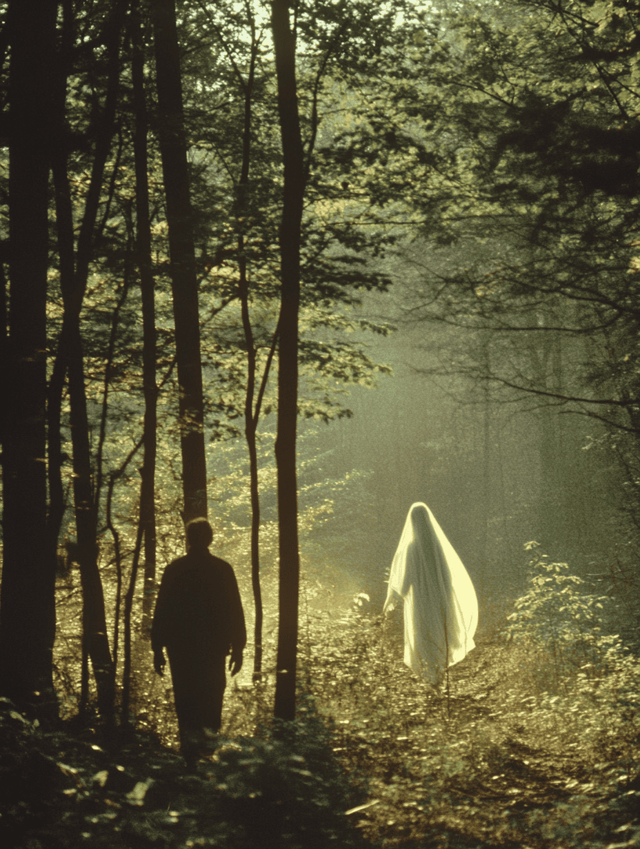
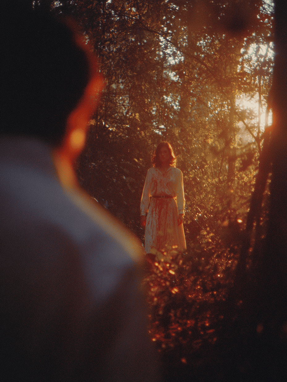
The older model actually outperformed the newer one in this comparison. When I specified a David Lynch-inspired horror scene in the forest, V6.1 delivered exactly what I wanted. There's an unsettling quality to the image that captures that signature Lynch eeriness. The lighting, the composition, the facial expressions — it all works together to create that pit-in-your-stomach feeling that great horror delivers.
V7's attempt is technically competent but misses the emotional mark. It's too clean, too perfectly composed to be genuinely unsettling. The characters look posed rather than caught in a moment of dread. It's the difference between an actual horror movie and a high-budget TV show trying to do horror — all the elements are there, but the soul of it is missing.
Product Photography
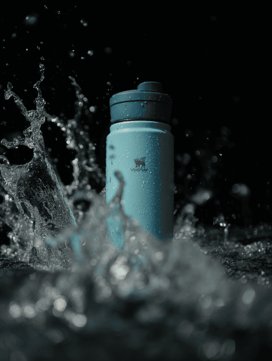
Prompt: commercial photography, a hydroflask, centered, soft lighting, waves of water crashing into the product
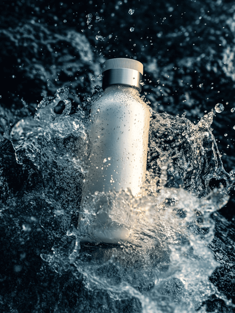
V6.1 already did a decent job here, creating a commercial-worthy image of the water bottle with splashing water in the background. The splash effect was somewhat exaggerated — a bit too perfect and dynamic compared to how water actually behaves — but overall, it was convincing enough for most marketing purposes.
V7's version shows small improvements in the realism of the water physics, but honestly, the difference isn't dramatic. What's interesting is that the lighting actually took a step backward. V7's attempt has slightly darker lighting that doesn't showcase the product as effectively.
Illustrations
Prompt: wide shot, comic book illustration of a supervillain that can control ice, clean line art painted by Ilya Kuvshinov, Ed Brubaker, Apollonia Saintclair, Jack Kirby, Brian Michael Bendis
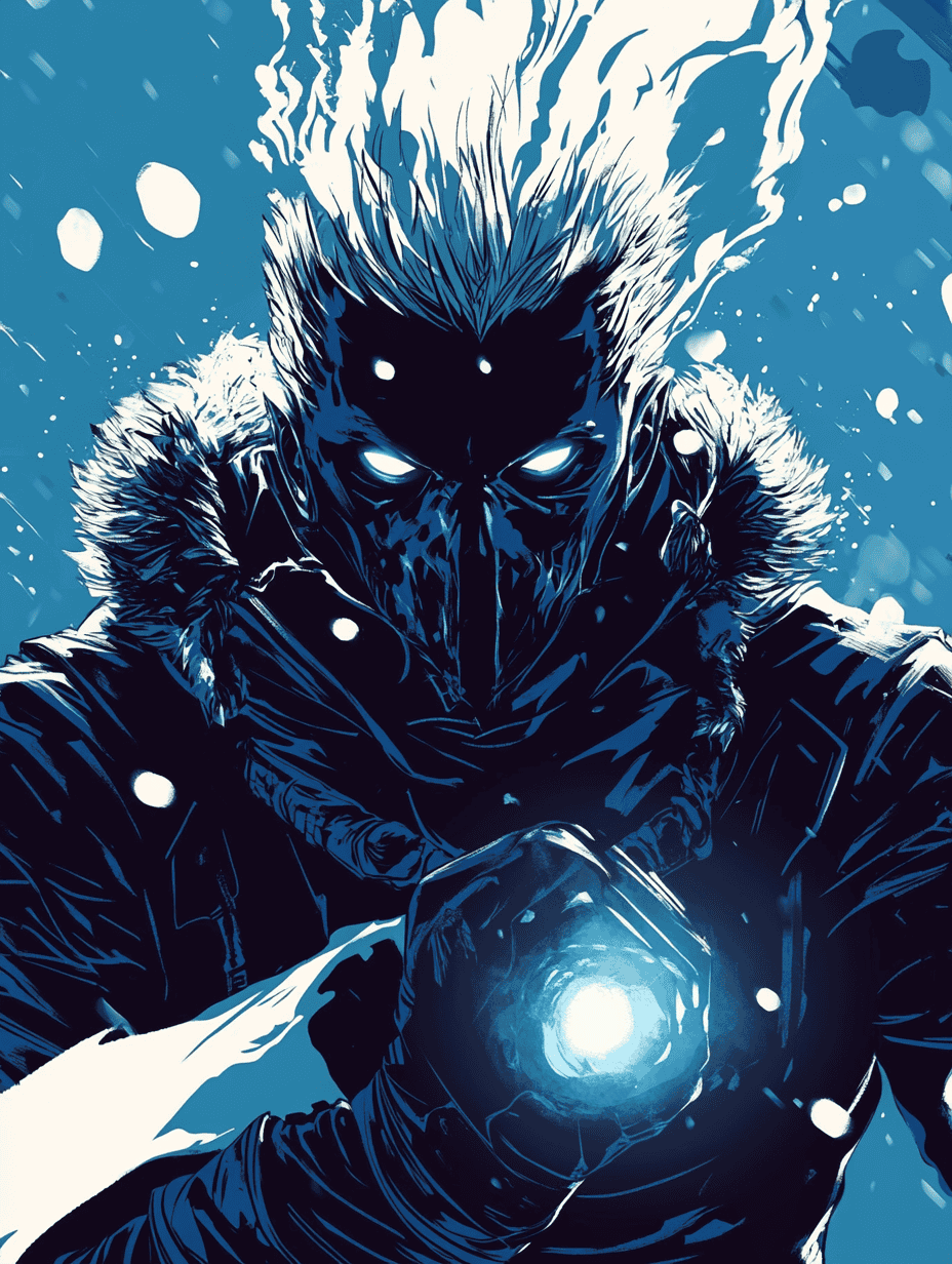
V6.1 absolutely nailed the classic comic book aesthetic — limited color palette dominated by blacks and blues, dramatic contrasts, and a genuinely menacing character design. It's exactly what you'd expect from a 90s/2000s comic villain, complete with that sinister design that says "I'm about to freeze this entire city."
V7's interpretation feels like it's trying too hard to be artistic rather than authentic to the source material. It's more surreal, more "post-modern" in its approach, something you'd see in a 2010s reimagining rather than a classic comic. The technical quality is there, but it's like the model decided to put its own spin on things rather than deliver what was actually requested.
This is one of those cases where the "improved" model actually moves further away from what many users might want.
Digital Art
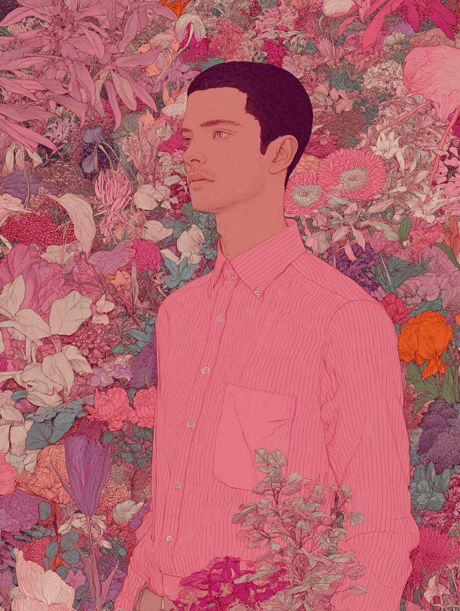
Prompt: a man in a pink pastel shirt surrounded by flowers of different variety and colors, digital art, Brewstercolor
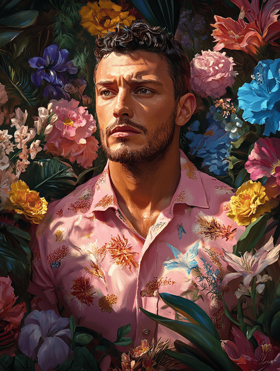
The V6.1 version is exactly what you'd expect — vibrant, eye-catching, and literal. It's the kind of image that grabs your attention immediately with its bold colors and straightforward interpretation of the prompt. There's nothing wrong with it — in fact, it's quite beautiful in its own right.
But V7's approach demonstrates a more sophisticated understanding of artistic subtlety. It uses a more muted color palette but employs it with greater intentionality. The composition feels more thoughtful, less obvious. It's the difference between art that shouts for your attention and art that invites you to look closer..
Text Generation
Prompt: a surrealist street sign that says "THE BUCK STOPS HERE, BUDDY"
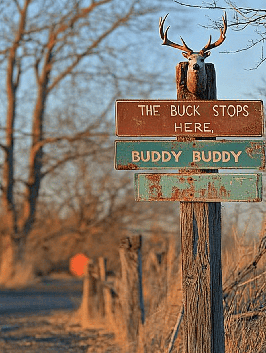
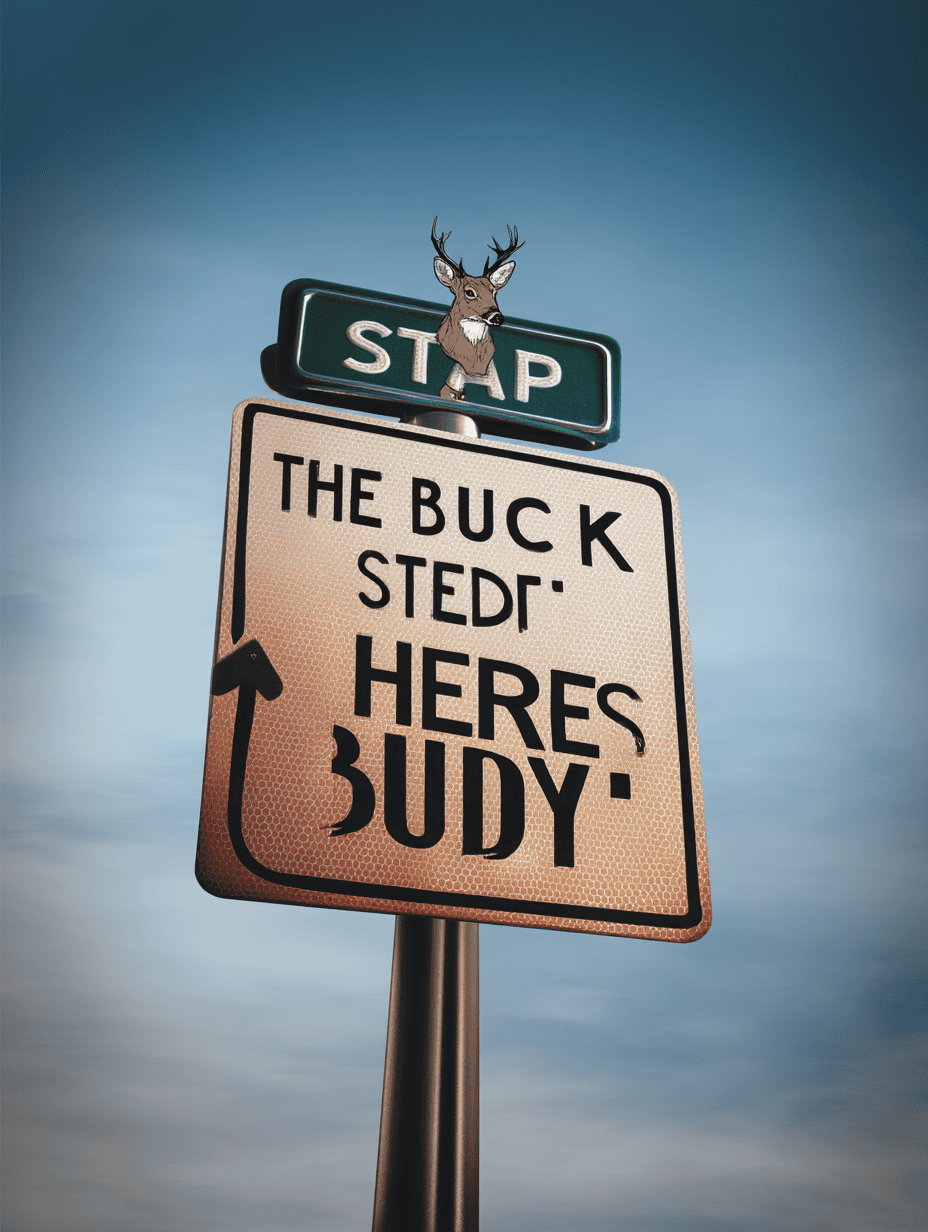
Let's be real — neither V6.1 nor V7 has figured out text generation, and it's honestly kind of hilarious. Both versions completely botched the simple request to create a sign saying "The buck stops here, buddy." What we got instead was a jumbled mess of almost-words that look convincing from a distance but fall apart completely when you actually try to read them.
The Bottom Line
Midjourney V7 is a mixed bag. On paper, it promises smarter generations, faster speeds, and more artistic control — and in certain use cases, you do see those improvements. But when you actually put it up against V6.1, the results aren’t consistently better. Sometimes they’re just different. And occasionally, they’re worse.
In some prompts, V7 leans so hard into aesthetics that it misses the brief entirely. It feels like the model is trying to impress rather than interpret — prioritizing style over substance, which is usually okay, except when the “new style” is the same as before.
Sure, the personalization feature is interesting, but style isn’t everything. If the model can’t consistently deliver accurate images, those bells and whistles don’t mean much.
At the end of the day, V7 isn’t the clear upgrade Midjourney wants you to believe it is. It’s a step forward in some areas, a sidestep in others, and a stumble in a few. Worth exploring? Yes. But don’t expect it to replace your go-to workflow just yet.
Want to Learn Even More?
If you enjoyed this article, subscribe to our free newsletter where we share tips & tricks on how to use tech & AI to grow and optimize your business, career, and life.

